● ENGINEERING DISPATCH•September 12, 2026•8 min read
7 Mistakes That Make Developer Portfolios Look Unprofessional
Your developer portfolio can have great projects and still look unprofessional. Here are 7 common portfolio mistakes, from cluttered design and weak project descriptions to broken links and outdated information.
7 Mistakes That Make Developer Portfolios Look Unprofessional
A developer portfolio is supposed to make a strong first impression.
But sometimes, a portfolio does the opposite.
You might have impressive projects, solid technical skills, and years of experience, yet a few avoidable mistakes can make your portfolio feel unfinished, outdated, or difficult to trust.
The good news is that most of these problems are easy to fix.
Here are 7 mistakes that can make a developer portfolio look unprofessional, along with practical ways to improve each one.
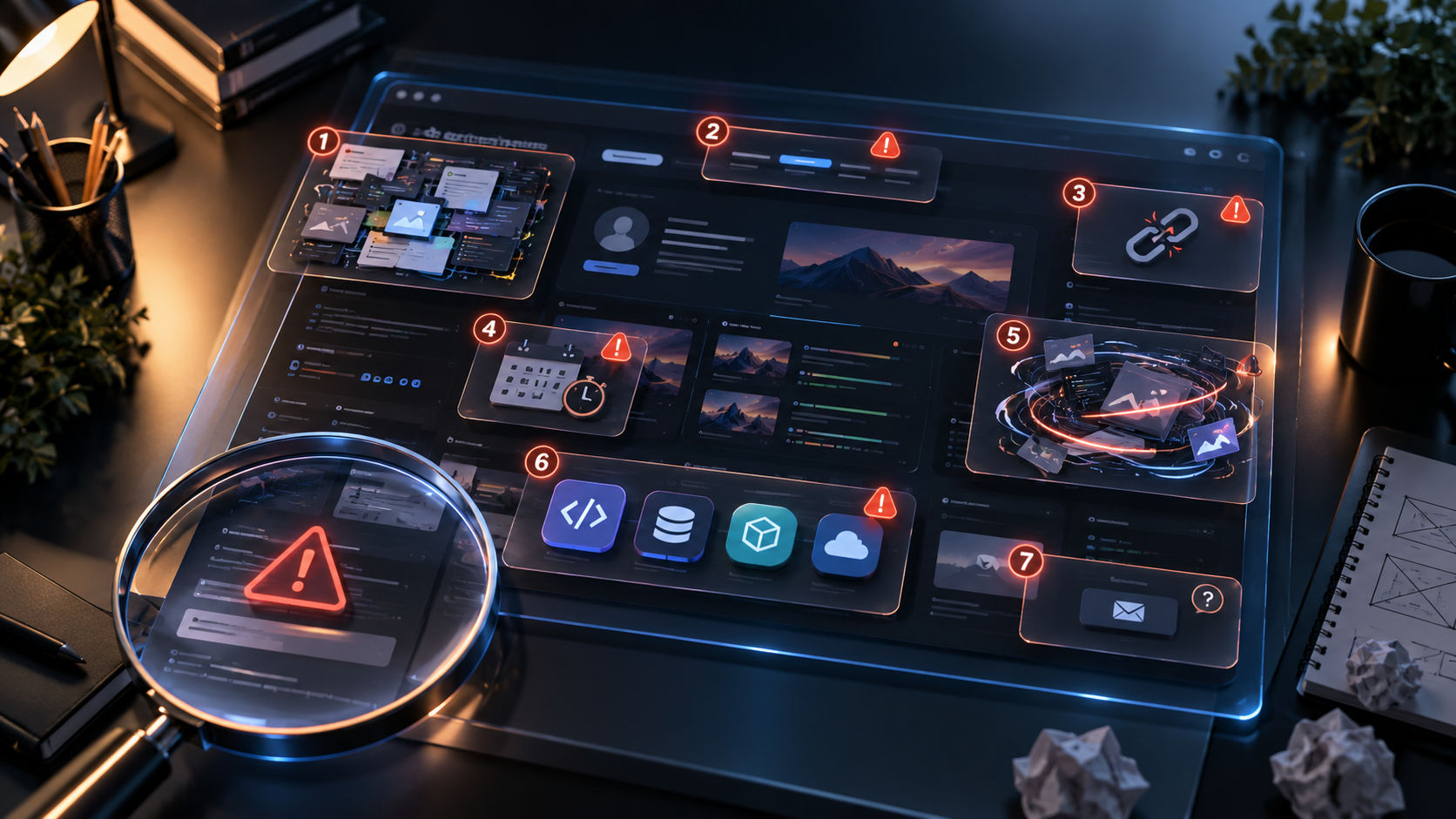
1. Trying to Show Everything
One of the most common portfolio mistakes is treating your website like a storage box for everything you've ever built.
Ten unfinished projects.
Twenty technologies.
Every college assignment.
Random experiments from three years ago.
A long list of certificates.
More content doesn't automatically make a portfolio stronger.
In fact, too much content can make it harder for recruiters and clients to identify your best work.
What to Do Instead
Curate your portfolio.
Choose a small number of projects that best represent your abilities.
For example:
3–5 featured projects
Your most relevant technical skills
Your strongest professional experiences
Your most meaningful achievements
Selected certifications or education details
Think of your portfolio as a highlight reel, not an archive.
PX
Profilix Engineering Desk
Architecting modern developer career workflows
INITIALIZE YOUR INTELLIGENT WORKSPACE
Ready to Accelerate Your Engineering Career?
Compile ATS-ready resumes, sync your GitHub heatmaps, and share a standalone portfolio that stands out to technical recruiters.
Every section should have a reason for being there.
2. Using a Generic or Unclear Introduction
Your introduction is usually one of the first things visitors see.
If it says:
"Hello, I'm Alex. I am a passionate developer who loves coding."
it doesn't tell the visitor much.
Thousands of developers could use the same sentence.
Your introduction should quickly communicate what you actually do.
For example:
"Full-stack developer building scalable SaaS products with TypeScript, React, Node.js, and PostgreSQL."
That's much more useful.
A Good Introduction Should Answer
Who are you?
What kind of developer are you?
What technologies or areas do you specialize in?
What kind of problems do you solve?
What are you currently interested in?
You don't need a paragraph.
A clear headline and a short supporting description can be enough.
3. Poor Project Descriptions
A project card that says:
"E-commerce website built with React."
doesn't tell a recruiter much.
What did you actually build?
What problem did you solve?
What was difficult?
What technologies did you use?
What was your contribution?
A strong project description provides context.
For example:
"Built a full-stack e-commerce platform with product search, authentication, payments, inventory management, and an admin dashboard using Next.js, Node.js, and PostgreSQL."
Now the visitor has a much better understanding of the project.
Make Projects Tell a Story
For important projects, consider including:
Problem
What were you trying to solve?
Solution
What did you build?
Technology
What tools and technologies did you use?
Challenges
What technical problems did you encounter?
Result
What happened after you built it?
This transforms a project from a screenshot into evidence of your engineering ability.
4. Too Many Animations and Visual Effects
A developer portfolio is a great place to experiment with design.
But there is a difference between interesting design and visual noise.
Excessive:
Parallax effects
Page transitions
Cursor effects
3D animations
Loading screens
Background particles
Glowing elements
Scrolling animations
can make a portfolio difficult to use.
It can also hurt performance.
A recruiter shouldn't need to wait through a five-second animation just to read your introduction.
Use Animation With Purpose
Animations can be excellent when they:
Guide attention
Explain interactions
Provide feedback
Create visual hierarchy
Add personality
But if an animation exists only because it looks cool, ask yourself whether it improves the experience.
A polished portfolio doesn't necessarily need to be minimal.
It simply needs to be intentional.
5. Broken Links and Outdated Information
Nothing makes a portfolio look unfinished faster than clicking:
Live Demo → 404
or:
GitHub → Repository unavailable
Other common problems include:
Old job information
Outdated technology lists
Expired project demos
Missing images
Incorrect social links
Old email addresses
Projects that no longer work
Copyright dates that haven't been updated
These details may seem small, but they affect credibility.
Create a Portfolio Maintenance Habit
Every few months, check:
All external links
Project demos
GitHub repositories
Resume
Work experience
Technology stack
Contact information
Social profiles
Your portfolio should represent your current professional identity, not who you were two years ago.
6. Listing Technologies You Barely Know
Another common mistake is turning the skills section into a technology collection.
React.
Vue.
Angular.
Svelte.
Next.js.
Nuxt.
Node.js.
Django.
Laravel.
Go.
Rust.
Java.
C++.
Python.
And another 30 technologies.
The problem isn't having many skills.
The problem is presenting technologies you've barely used as if they're core expertise.
Prioritize Your Core Stack
Organize your skills based on your actual experience.
For example:
Primary
TypeScript
React
Next.js
Node.js
Backend & Data
PostgreSQL
Redis
REST APIs
Infrastructure
Docker
AWS
GitHub Actions
This is more credible than presenting 40 technologies with no indication of your experience.
Your portfolio should communicate depth, not just breadth.
7. Making It Difficult to Contact You
Imagine someone visits your portfolio, likes your work, and wants to contact you.
Then they have to:
Open the menu.
Find an About page.
Scroll to the bottom.
Search for a social link.
Open another platform.
Find your email.
That's unnecessary friction.
Your contact information should be easy to find.
Consider having a clear CTA such as:
Let's Work Together
Get in Touch
Contact Me
or
Available for Opportunities
You can provide:
Email
LinkedIn
GitHub
Contact form
Other relevant professional profiles
If you're actively looking for work, make that clear.
Bonus Mistake: Designing for Yourself Instead of Your Audience
There is another mistake worth mentioning.
Sometimes developers build portfolios primarily to impress other developers.
They add complicated architecture diagrams, dozens of technical details, experimental UI interactions, and technologies simply because they're interesting.
But your audience might be:
Recruiters
Hiring managers
Clients
Startup founders
Engineering managers
Potential collaborators
Not all of them want to inspect your codebase.
Your portfolio should make sense to both technical and non-technical visitors.
You can provide technical depth without making the entire experience difficult to understand.
How to Make Your Portfolio Look More Professional
Once you've removed the obvious problems, focus on the fundamentals.
Keep the Navigation Simple
A basic structure can work extremely well:
Home → Projects → Experience → About → Contact
Don't create ten different pages when five will do.
Use Consistent Typography
Choose a small number of fonts and establish a clear hierarchy.
Your:
Headings
Body text
Buttons
Labels
Project descriptions
should feel like part of the same design system.
Use High-Quality Visuals
Project screenshots should be:
Sharp
Properly cropped
Consistently sized
Relevant to the project
Avoid screenshots showing broken layouts, development tools, browser errors, or unrelated content.
Make Important Information Scannable
Recruiters may not read every word.
Use:
Short paragraphs
Clear headings
Bullet points
Highlighted technologies
Project summaries
Meaningful metrics
Make it easy to understand your work in seconds.
A Simple Portfolio Quality Checklist
Before publishing your portfolio, ask:
Content
Is my introduction clear?
Are my best projects featured?
Do my project descriptions explain what I actually built?
Is my experience current?
Are my skills accurate?
Design
Is the visual hierarchy clear?
Is the typography readable?
Are animations helping rather than distracting?
Does the design work on mobile?
Technical Quality
Do all links work?
Are images optimized?
Does the site load quickly?
Are there console errors?
Does the site work across modern browsers?
Professional Presence
Is my resume up to date?
Is my GitHub linked?
Is my professional profile linked?
Can someone contact me easily?
If you can answer "yes" to most of these questions, you're already in a much better position.
Your Portfolio Doesn't Need to Be Perfect
It's easy to spend weeks tweaking colors, animations, gradients, and layouts.
At some point, you need to ship.
A portfolio with three excellent projects and a clear explanation is better than a beautiful portfolio that's still under construction.
Start with the fundamentals.
Then improve it over time.
Your portfolio should evolve as your career evolves.
Final Thoughts
A professional developer portfolio isn't about having the most impressive animations or the longest list of technologies.
It's about clarity, credibility, and evidence.
Show your strongest work.
Explain what you built.
Keep your information current.
Make the experience easy to navigate.
And remove anything that distracts visitors from understanding what you can do.
Your portfolio is often the first impression someone gets of you online.
Make sure it looks like the work you're capable of producing.